What Is a Heat Map and How to Analyze It
General Updates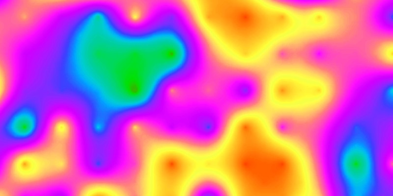
There’s no shortage of ways to analyze the effectiveness of your online presence. You’ve got plenty of analytics tools capable of retrieving loads of data to help you optimize your business website and achieve higher conversion rates.
One of the widely-used methods of analyzing your on-page engagement and visitor behavior is heat mapping. What a heat map is and what kind of information it can provide you with, we will find out further in this article.
What is a heat map?
A heat map is a visual representation of how page visitors read through its content and interact with it. Its goal is to give you an idea of how much engagement different areas of your website pages generate. Thus, you can easily see which page sections draw the most of visitors’ attention and which are generally left out.
Figuratively speaking, analyzing a heat map is like looking at your website page through heat vision goggles. The “hot” areas of a page are highlighted with warmer colors like yellow and red, while the “cold” areas are green and blue.
The “temperature” is determined by how often and how long people look at or interact with specific parts of a page. The hottest areas indicate where exactly your visitors focus their attention and what actions they perform (or attempt to perform).
A heat map can be made using various tools widely available throughout the web. However, not all heat maps are alike.

Heat map types
There are multiple types of heat maps based on different signals and used for various purposes. The most common and widely used are scroll maps, click maps, and hover maps.
Scroll maps
These heat maps show how far your visitors scroll your page down before leaving. Scroll maps also allow you to see how much attention people pay to different sections of a page and how much time they spend focusing on each of them. Thus, the most engaging parts will be marked as the hottest, while those that get the least attention will be cold.
The greatest advantage of scroll maps is that they give you an insight into how long your audience is kept engaged throughout the entire page and where exactly they start to lose interest. Apparently, this heat map type is especially useful for analyzing long pages with a lot of content on them, for instance, blog pages or landing pages.
Depending on data obtained from a scroll map, you can organize your page better by putting the most important information in the hottest sections while leaving the rest of the content on the periphery. Following the same logic, you can place your converting elements (like CTAs, links or specific navigation cues) more strategically.
Furthermore, a scroll map can not only help you arrange your content more efficiently but also optimize your website design. For example, if a heat map suggests that visitors leave your page too early, perhaps there’s a strong disconnection in the design of its sections. In this case, it makes sense to unify the page design, use the colors that would make the entire user experience more seamless, etc.

Click maps
A click map allows you to see where exactly on your page visitors click and how frequently. The areas which get most of the clicks are considered the hottest. Thus, for example, you can immediately find out whether your CTAs are effective enough. If it turns out that your calls-to-action receive fewer clicks than expected, consider changing its location on the page or eliminating any distracting elements that are of less importance.
The same goes for links. A click map can show you which links on the page perform best and which are left unnoticed or generate no interest whatsoever. At the same time, you can see whether people click on the elements they think should be links but which are not (e.g., an image, unlinked logo in a header, highlighted text, etc.). In this case, you should consider placing links where visitors suppose they should be. This can facilitate your conversion rate and improve the overall user experience.

Hover maps
A hover map indicates where page visitors hover their cursor while reading through its content. The areas where a cursor hovers the longest are the hottest. Ideally, this type of heat map should represent how visitors’ attention is distributed across the page. It bases on the assumption that people point a cursor at the screen areas they are looking at.
However, this assumption doesn’t always justify itself. The research shows that 80% of people don’t actually show any correlation between eye tracking and mouse tracking. This finding questions the whole idea of using hover maps, leaving their accuracy and credibility under serious doubt.
But this doesn’t mean that hover maps are useless. While they often fail to explain how visitors scan through a page, these heat maps can give a basic insight into how people navigate a website. In this case, cursor positioning and mouse movements play the decisive role.

Key findings
To know how your specific website pages perform, you have to make your own heat maps and analyze them. This is the only way to figure out what works for your site and what needs improvement. But there are some general findings that heat maps allowed to unearth. And they can point you in the right direction when designing your website and creating content:
- The most important information should be presented “above the fold”: Heat maps show that people rarely scroll down to the very end of a page. Usually, they do no more than a few scrolls before leaving.
- People “scan” pages rather than read them entirely: Visitors don’t want to spend a lot of time on one single page. So the faster they can make it to the end, the likelier it is that they won’t abandon the page too early. To make your pages more scannable, use lists (bulleted or numbered), clear fonts and text formatting, distinct headings and subheadings, etc.
- Images hold visitors’ attention: People’s attention span is very short. Therefore, you need to find ways to keep them engaged throughout the entire page. Eye-catching images generate a lot of engagement, so using them can keep visitors focused on your content for a longer time.
Conclusion
A heat map can help you understand the behavior of your website visitors and optimize pages better in terms of content and web design. However, relying solely on heat mapping is hardly a good way of analyzing your website performance.
Visualization is a very convenient but extremely subjective method. Therefore, most heat maps are open to different interpretations. Accurate and credible data can only be obtained when combining the heat map analysis with the use of advanced analytics tools.
